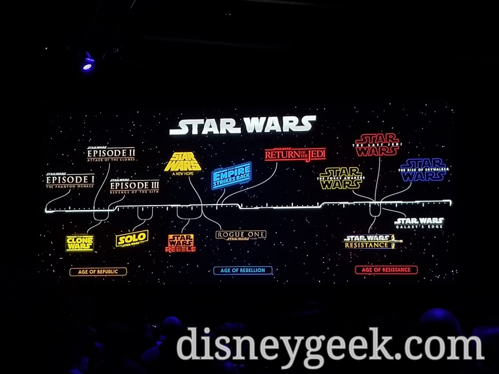
I always loved the prerelease design of A New Hope’s “Star Wars”, but just sticking an Arial font for “A New Hope” underneath looks trite. Disney should have reshaped “A New Hope” in that triangular design. And I really love that the eras are now designated as “Republic, Rebellion, and Resistance” (no lie, I’ve been calling them that since the Force Awakened).
Otherwise, for the Republic trilogy, nix the big “Episode” subtitles and just have the titles of I-III in big letters (haters’ opinions do not apply).
 #D23Expo Disney+ Announcement of three new Marvel Shows
I always loved the prerelease design of A New Hope’s “Star Wars”, but just sticking an Arial font for “A New Hope” underneath looks trite. Disney should have reshaped “A New Hope” in that triangular design. And I really love that the eras are now designated as “Republic, Rebellion, and Resistance” (no lie, I’ve been calling them that since the Force Awakened).
Otherwise, for the Republic trilogy, nix the big “Episode” subtitles and just have the titles of I-III in big letters (haters’ opinions do not apply).